
Going the Distance
SoulSynch is a relationship app for long distance couples, meant to bridge the gap and strengthen their relationships. My goal for this project was to create an application that helps couples stay in touch, spend quality time and feel even closer to one another, despite the distance. Our intention with this app is to demonstrate that love knows no boundaries, even virtual ones.

UX Designer, UX Researcher, Design Co-lead
Figma, Canva
UX Design
Class Project
14 Weeks
Challenge
The objective was to create a relationship app directed for couples who were struggling with Long Distance. The problem we had was figuring out how to make this app different than the competition, and how to find ways for couples to spend time together and strengthen their relationship online versus in person.
Results
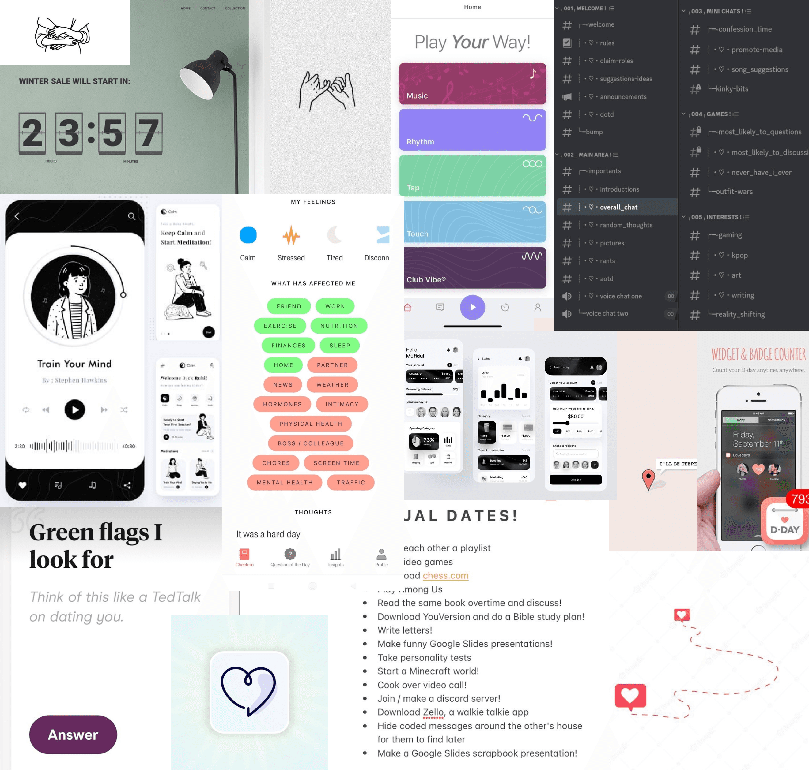
I decided to implement new features in the app to help with strengthening relationship bonds, and creating new things for couples to do together despite the distance:
Daily Questionnaire
Allows you to understand your partner more, and you can view and share each other's answers and compare
Date Night Ideas
Ideas based on general categories that recommend date ideas that can be done completely virtual
Raise a Pet
Raise a pet together, by feeding it, petting it and taking turns to bond with you pet as parents
Journal
Never miss those moments with the photo journal app! Share your favourite memories with each other!
Want to explore and create deeper connections? Click on our prototype to try!
Dating Apps are not the only thing hot in the market
Sometimes going on a date to find your next true love can be daunting, but have you ever thought to consider: does dating just end when you match? What about apps designed for couples?
You could definitely search for date ideas on google, or find ways to keep up with each other on different apps, but what if there was an app that could do it all? And better yet, an app that lets you do it all from anywhere in the world?
Meet Soulsynch, your new relationship app — long distance edition.
We asked real experts, real questions.
We gathered research data through user surveys and usability testing on our mid-fidelity prototype. We asked a total of 8 people from the user surveys about their thoughts on LDR, relationship apps and features they would love to see in an app. We also interviewed 3 usability participants as well.
35%
of users are in/ have been in a relationship
25%
of users are in a long distance relationship
84%
wouldn't do long distance
Among these statistics, we also found out that 37.5% of users wanted to find new activities to do with their partner despite the distance, 87.5% wanted to feel emotionally connected and 62.5% wanted to share important life updates and events with each other. Keeping this in mind, we wanted to design features that addressed these pain points simply and effectively.
It's not about being unique, but original.
Truth be told, we're not the only ones who have thought about this. In fact, there are a bunch of competitors creating apps for similar problems. And we wanted to take inspiration from them, and see where we could improve. What makes SoulSynch so good? It takes good to become even better.

So many of these apps served well for different functions and appeals, but we wanted to create something that builds on their existing features and make it even better. So we decided to combine popular features and place them in one singular app, so users don't have to open 5 different websites and platforms to stay connected. They can do it all in one place, and it's available on all app stores.
A journey that is simple, easy and brings two people even closer
I went ahead and also created a user flow diagram that illustrates the flow and paths of our app. This helped me understand what the user will expect when navigating our application, making things feel seamless and straight to the point as well as intuitive.
Our homepage which also happens to be the landing page, allows users to choose different options and features that leads them to different pathways. This flow helped us design and prototype our product to allow different pathways, but a unified singular way to get back to the homepage without pressing the back button too many times.
Prototype, Test and Prototype Again
Before we could create the app, me and my teammate sat down and brainstormed ideas, the different pages we would like to design, and organized it with the user flow. We started off with sketching, before moving onto wireframing for both low-fidelity, animating our mid-fidelity for usability testing, and then finally designing our high-fidelity prototype.
We started off with some basic sketches, just to understand what key components needed to be illustrated to be include in our application. Based on our survey feedback, we knew we needed to create features that allowed bonding, new date ideas to spark things up in their relationships and ways to share memories across the globe. In return, we created pages such as Messaging, Calendar, Date Ideas, Questionnaire, Photo Journals, Interactive Maps and Raising a Pet.
Originally, we wanted to create pages such as a profile page — where users can store their information, likes and dislikes. But we quickly scrapped that, because after feedback sessions with our instructor, we realized this wasn't a dating app. And there was no need for a profile if it's an app meant to be between two people anyways. We also decided to create another page for anniversary countdown, so it wouldn't clutter the calendar.

Iterate, Improve and Design
Designing mobile applications require a lot of iteration and improvement, and we interviewed potential users who gave us feedback on the app, and things they would love to see being implemented. And we listened.
Among our usability testing sessions, we found areas of improvement. Users loved the date ideas, but some of them didn't seem practical or possible — such as joint Karaoke. The Raise a Pet feature needed better interactions, and more options and details. One user loved the daily questions, as it made them feel more connected to their partners, but would also love customization options such as choosing the app's background.
The tests indicate that some pages didn't flow together properly, or users would expect there was a way to go back and there wasn't. Or some features weren't fully prototyped or functioning properly which caused frustration.
We kept all of these in mind for our high-fidelity prototype where we addressed these painpoints.


Vision boarding
I wanted to create an app that not only functions well, but also fed into a certain style or aesthetic. My co-lead and I found some inspiration photos of similar applications, features and interfaces that allowed us to envision what we needed to include in our app. We took heavy inspiration from applications such as Hinge, Discord, and Apples Design System.
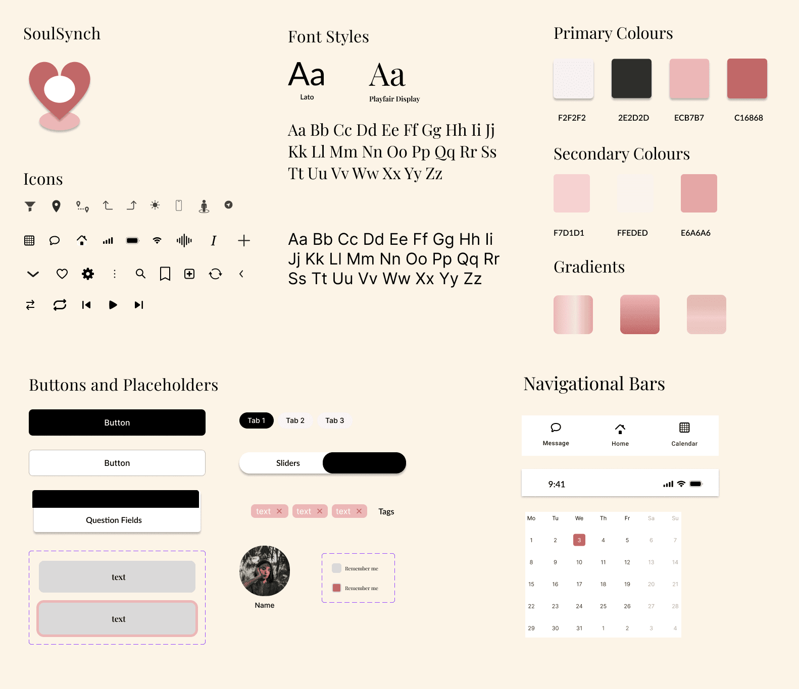
Design System
For our Design system, we used fonts from two (2) different family types to create contrast and softness in our interface. We used icons from iconify, to keep our design minimal but cute.
For our colour palette, we stuck to mostly black and white, for text and details. We chose different shades and variants of two pinks — we chose pink for our colour palette to represent our values of love, passion and sweetness.
“ I love SoulSynch, it seems great for long distance relationships, and it lets me check up on my partner from anywhere in the world. ”

Anon
Student
“ I love the Raise a Pet feature in SoulSynch, I'd love to see how me and my partner raise the pet as parents, and watch it grow up ”
Anon
Working Professional
Key Takeaways
There are a few things I've learned in this project: building an application from scratch is not the same as redesigning an existing app. There was much more testing and research that needed to be done in a short time frame, and it was very difficult deciding colours, text styles and branding. And it definitely requires all types of people to be working on it, not just two designers.
However, this project taught me more about time and project management. I learned how to not only coordinate with my co-lead about decisions about the product, but how to combine both of our design styles and keep it consistent with the design style language we chose.
Something I struggled a lot was balancing our colour palette in the design. Sometimes the designs felt too empty or boxy, and I didn't want to overwhelm the design with too much white space. This is something I want to revisit and maybe change the look and feel of the app to be more dynamic instead of flat.
I also learned that in an app, certain features will have more pages and tons of more interactions than others (ie: Raising a Pet). I also want to be able to add more content that refreshes weekly, like the date ideas and more variety for the daily questions. As much as I wanted to create an app that does everything, it was also hard to implement some features because it wasn't just a messaging app, or a journal app.
Hi-fi isn't the end of Soul Synch, I also got valuable feedback from usability participants, my instructors and other users that didn't have a chance to be implemented. The next steps are to conduct more testing, change certain colours so it is readable on both light and dark mode, and I want to conduct an accessibility audit as well.