
Reshaping Fast Fashion through User Interface
H&M is an online fashion store where you can shop for clothes, accessories and more. It’s website is designed for ease of use, and catered to men, women and children. It offers different items in its catalogue, including lifestyle décor to decorate your home.
By conducting UX Research and performing usability testing, I wanted to see how my team and I could improve H&M’s user experience on the website to help retain customer loyalty and drive sales — both online and in-store. By redesigning their website, it can create better user flow and experience for users, which allows H&M to feature their best products and services for their online clientele.

UX Researcher
Moderator and Note Taker, Pitch Deck
Figma, Zoom, Google Docs
UX Research
Class Project
3 weeks (December 2023)
Challenge
H&M needed to drive their online sales as they were experiencing a decrease in their instore traffic. However, some of the features on the website do not fulfill target customer's needs.
How Might We… design features that allow seamless online shopping experience to drive loyalty and sales retention?
Results
After conducting usability testing and interviews, we came up with (3) solutions:
Highlight "Shop by Occasion" on the Main page: This way it is visible on the main page when users are on the landing page. It should also be made inclusive to Men and Women, for all types of occasions aside from the Party Edit.
Improve the Cart and Checkout Process: being able to view totals, shipping information and payment methods before account creation will decrease the chances of abandoned carts. Recommendation page might be helpful for users, based on purchase or viewing history.
Quick Preview: The ability to see the item in different colours, view sizing and can expand for more details if interested. Also including quick glimpse of reviews and ratings creates trust and transparency with customers.

Everything starts with data…
Research & Analysis: Primarily we conducted research on the competitor's and evaluated the importance of issues based on heuristics and severity. We then created proto personas and journey maps for our users.
Recruitment and Interviews: Also created a moderator's script for interviews, screener and recruiting participants to partake in our usability session.
Usability Testing: We conducted usability tests with a different types of users to understand their shopping habits, experience with the website and their thoughts on H&M's new feature. Based on the feedback, we made necessary adjustments to the design.
Presentation and Report: We developed a report and pitch deck summarizing our findings and creating the next steps for us to take in our future design.


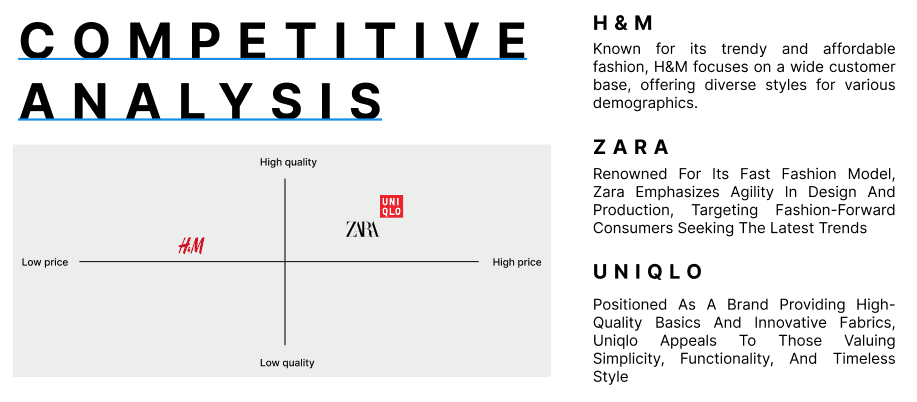
Understanding the Market Trends
Prior to redesigning or further iteration, we collected some data by studying the competition, conducting user research through interviews and doing usability testing. Our team looked at some of the most popular fast fashion brands to understand how their website demonstrates the user interface and branding.

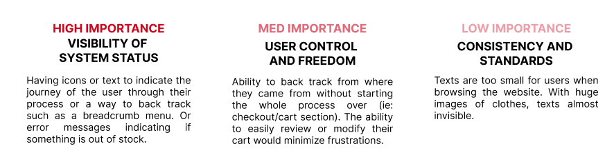
We also conducted a heuristic evaluation on H&M's current website to understand any usability issues that might affect the user's experience navigating the website. Below I've identified and ranked them according to importance.
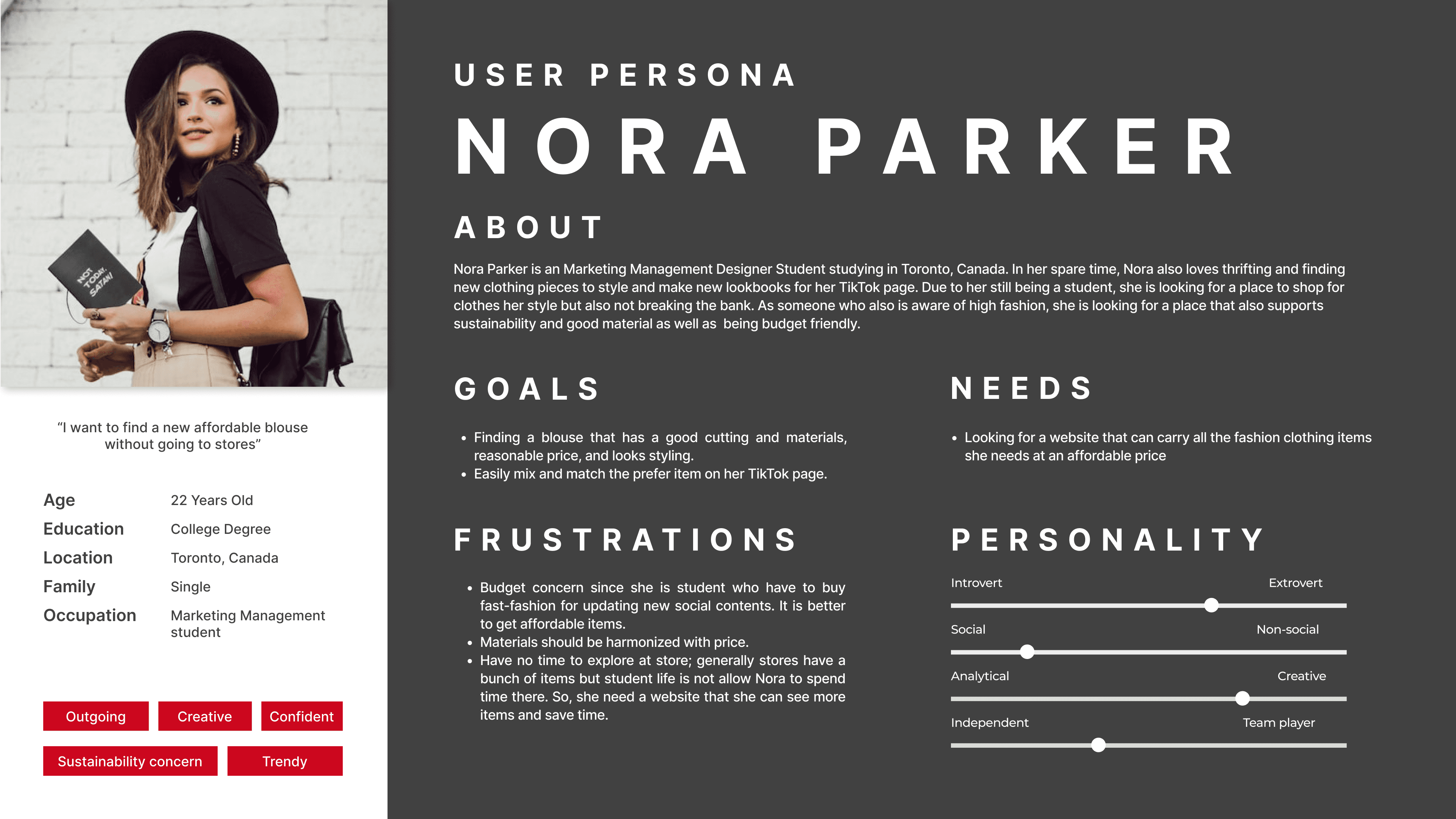
I also created proto personas to represent our likely user going on their shopping journey with H&M which later helped us form the best testing scenarios and questions to ask our participants later in the usability testing sessions.
Meet Nora (22F), who is a student based in Toronto trying to shop sustainably without breaking the bank, and keeping up with the latest fashion trends.
The best results come straight from the users
While conducting a usability testing audit, we created consent forms, screeners, moderator scripts and note taking documents. These documents were to ensure consistency and objectivity during the testing process. The script allowed us to track our questions and follow up with probing questions, thus eliminating bias and enabling a more systematic evaluation of the user's experience.
Consent forms ensured participant's comfort level with recording for documentation purposes only, and it creates trust between them and us as researchers, and allowing us to prioritize their rights and privacy by being transparent with the purpose of the study, risk and any ethical considerations that needed to be taken into account.

The task scenarios participants received were two different pathways of browsing the website, to making a purchase and checking out the items without ever leaving their house. One scenario is to find an outfit they liked and check out, while the other scenario focuses on them finding the new feature "Shop by Occasion" and select an outfit from that category.
Fast Fashion isn't as inclusive as we think…
Some people don't feel like the Shop by Occasion category is relevant for them as it only considers outfits curated for the Party Edit. 75% of users hardly consider H&M as a fashion retailer to go to for shopping for party outfits to begin with. But 80% of users expressed dissatisfaction as this new feature is not only hard to find, but it seems to only cater to Women, despite offering clothing selection for Men and Kids as well. It seems to lack inclusive design in not only their website but the services they offer online.
Navigating is also something that users struggled with. When looking for the perfect outfit, they found it difficult to navigate the sizing chart, and there was too much text with minimal visuals which makes it hard to find the dream item. A lot of users did express frustration with the last minute sign up after checking out their items, it made 65% of them want to abandon their cart. Another important feature that was lacking in this website design were ratings and reviews for users to check out before selecting an item, which had a negative impact on their experience navigating the website.
The Future of Fashion
Fashion is definitely evolved beyond materialism and people aren't just shopping for clothes for certain occasions no more. Fashion is one avenue of self-expression, and users are getting more conscious of what they are purchasing and most importantly, where it is sourced from. When brands are inclusive, sustainable and are affordable, more people are likely to shop from a company that makes them feel good about their buying decisions. Keeping this in mind, as a team we mapped out the next steps of the redesign.
Move the Shop by Occasion to the homepage
Designers can collaborate with the web development team to restructure the homepage layout, advertising this new feature the moment people reach the landing page. This creates exposure and awareness, and educate people on the new feature H&M is trying to push out.
Expand Occasion Range for BOTH genders
Women aren't the only ones who could benefit from this new collection feature, and there are more occasions aside from the Party Edit that users might be interested in. It's important to promote inclusivity by offering this feature for Men and Kids. By broadening the occasion category, customers could shop for scenarios such as Casual, Dinner, Work, etc.
Improve Checkout Process
By revamping the checkout process, this allows users to view total, payment method, and shipping information without a mandatory sign-up until the last step. An alternative is offering guest check out and a gentle reminder to sign up to keep track of their order. This way it decreases abandoned carts and increase traffic.
Great design starts with solving real problems user are facing
There's no point of a redesign if it doesn't function or solve user pain points. Sometimes you visit a new website, and you find yourself amazed with how good it looks visually. But if the flow of the website is difficult to navigate, it doesn't matter how good the website looks, if it doesn't function well.
By being able to conduct research first and run usability tests allowed me to see how to design for users, instead of altering parts of a website for it to look visually good. Studying the competition and conducting heuristics to evaluate issues based on importance also helped us shape solutions that can solve the user's existing problems and adjust the flow.
This also taught me the importance of balancing text and media, and there are ways to visually convey information. Branding is also beyond typography and logos, user perception of the company is often linked with their user experience of products and services. Just like how an in-store experience, great visual hierarchy and flow can great a good customer experience.
Testing is also essential, and a design is never properly finished. There is always room for improvement, and ways to create designs made for all types of users with different needs, such as accessibility issues.